JoeBank
Investing in America's Future
Explore Years of Potential Life Lost
Years of Potential Life Lost by at the National and State Levels, alongside Indicators
Understanding the Views
Seen below are two visualizations that provide a better understanding to how years of potential life lost vary at the state level and within each state across counties. As understood through the causal model, the state level view also provides a comparison of statistically significant indicators that contribute or mitigate years of potential life lost against the national average. In both views, the years of potential life lost are per capita, meaning on average each individual will lose that amount of years of potential life based off their location.
Years of Potential Life Lost Per Capita, Nationally
Viewed below is a map comparing the average years of potential life lost per person at a national level. The view is provided both geographically on the map and in a rank-ordered column to the right. Use your mouse cursor to hover over the map to find that state's average years of potential life lost in the column and, reciprocally, the column will highlight the state on the map.

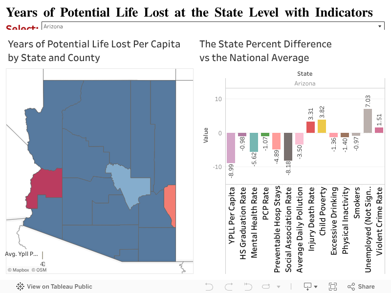
YPLL at the State and County Level with Indicators
In this view, please select a state from the drop down menu to view how the average years of potential life lost per capita within a state at the county level alongside the selected indicators from the causal model. As these indicators are less meaningful in absolute value, they have been converted to the percent difference from the national average. Please note that using the statisitcal model, all predictors except for Unemployment are found to significantly contribute or mitigate years of potential life lost.